We're all brought up on the basis that we're to share good things, so over the next few months, I'd like to share with you a few designs, ideas and items I've picked up in the factory over the past few weeks. After working here for a few years, still I'm impressed with new and exciting ways in which our customers design their business cards. It's important, no matter what sector of business you're in, that your cards make a decent first impression. The couple I've picked out to talk about certainly grabbed my eyes as good cards with excellent implementation of colour, design and layout.
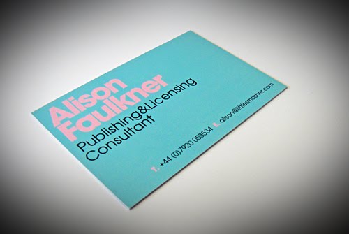
Alison Faulkner's business card wasn't an upload design, it was in fact one of our most popular templates on our website. What made it stand out to me was the colours that she decided upon. It's common knowledge that the retro look is 'in' at the moment and that fact has certainly been reflected in recent business card orders. The combination of duck-egg blue and pale pink makes for a very effective and easy-on-the-eye look. You can see Alison's card below.
Leaving the retro look behind and moving swiftly to the equally popular modern look, the guys at Radflek had their cards designed by Paul Holt who created a very crisp and clean design. When I first saw the cards, my mind was instantly drawn back to Apple's iPod advertising campaign (both on the television and in posters) that featured crisp, blocky characters dancing to music on their iPods. Eye catching colours and a sleek image make this one stand out from the crowd. Nicely done Paul!

I'll pop another couple of designs on as soon as possible. I originally planned to do one long blog post but I though it'd be better if I split it into a few pieces and spaced them out over a few weeks. Easier on the eyes that way and it's less time consuming.
If you've designed business cards with us and you think your design is worthy of a blog mention, please do send me an email on nick@goodprint.co.uk and I'll see what I can do! Anything to inspire us and others is welcome!
Cheers!
Nick
Love the colours on Alison's. I used the same template for the lang cat, my new business, but with grey and orange. The orange gets a lot of comments. Using a back with reversed colours and the URL plus a wee comment of 'do what you love' also seems to make it stand out.
ReplyDeleteI liked the colours too Mark, it gives it a nice aged feel without being boring. It's a very popular template but looks differ lots with colour changes. Do you generally get a good response to your business cards?
ReplyDelete